Thursday, May 19, 2016

2008, 2009, 2010 A Favorite Piece per Year

Collyer Brothers, 2008
I've chosen 3 of my favorite watercolor pieces from 2008-2010, all done for fun. I read the book Ghosty Men and was fascinated with the Collyer Brothers. I found their story quite touching, I won't go into it in detail here but you should look into it.

Life of Pi, 2009
My favorite section of the book Life of Pi was when the bolt of lightning strikes the water and he describes how it looked like a white tree with roots.

Imaginarium of Dr Parnassus, 2010
Terry Gilliam's Imaginarium of Dr Parnassus was definitely not his finest hour, but it inspired this painting which I love to this day. I like the patterns and the composition.

I created these in-between freelance jobs and around my full-time day job. It's very important to do personal work, it's a way to build up a portfolio of the kind of work you'd LIKE to be getting. It's a hoot looking at this stuff now, it seems like someone else created them- it's so weird.

Monday, May 16, 2016

2007-2009 Political Illustration

From 2007-2009, I did a lot of illustrations for Manhattan Media. They owned a bunch of free weekly newspapers: NY Press, The Capitol, City Hall, West Side Spirit & Our Town. These were the lowest paying jobs with the quickest turnaround times, mostly political subjects, it was very depressing but I had to pay my bills. Part of me wanted to hide these forever, but the thing I like about this site is that you get to see a progression and another side of my work. So... here we go!

Some illustrators make a career out of drawing people they dislike, but it's not for me. I dislike the corruption, greed and blatant illegal practices of politicians. I must have drawn Bloomberg 20 times, it was torture.

Sptizer is another one I've draw too many times, he was a big deal during this time because he was caught being a patron of escort services. I think this country has its priorities mixed up. What we choose to be outraged by vs bigger issues we don't really care about.

Never have I had to draw a more horrific site! The art director told me where to place each politician on the tower based on how they were doing in the race at the time. I guess Obama laughed last.

Another cover I drew, I really liked this one because it did not feature a politician!

This was funny because the art director told me to draw him peering into the piggy bank. Esther exclaimed, "But he's BLIND!" She suggested I have him shake it next to his ear, I'm so glad I did that! How insensitive that would have seemed.

This one is one of my favorites for a very odd reason. I used frisket film to mask out the words on the chalk board, to really get the texture/feel of chalk. When I pulled it up, it did exactly what I wanted.
 
Don't get me wrong, I vote every chance I get. I'll never give up trying to make this country better, even against such corruption which is consistently rewarded.


Sunday, May 15, 2016

2000 My Handmade High School Yearbook

Cover to my handmade yearbook 2000
I was not your average high school student: I never got my photo taken, didn't go to prom, didn't play sports, and didn't buy my yearbook. When my calligraphy & advertising teacher Mrs Jennifer Trettner asked us to do our final project in a calligraphy font of our own creation, I decided to make my own yearbook. Although the calligraphy font I created is ugly & illegible in places... and my layout skills left something to be desired... I love my handmade yearbook.

Teachers and students would write their messages/comments directly in the book (comments not featured here, those are mine!). Each page would have a yearbook-esque pic and a full drawing at the bottom, they would sign the opposite page. Here's a few memories from my yearbook...


My parting words for High School were borrowed from Roger Klotz, they are words of wisdom.

I'm thankful for my teacher Mrs Trettner. Her classes prepared me to be a professional in everything that I do. In the desert of Three Village, she had true passion & guts.

Sometimes I kick myself for not also buying an official yearbook, because it would've made the process of drawing autobiography "Secrets of Silent James" easier, but I'm proud to say my memory proved to be quite sharp! So... HA!

Sunday, May 8, 2016

05-05-16 Melt Banana and Napalm Death live

Melt-Banana 2016
We delightfully attended the Savage Imperial Death March tour last week featuring the lineup of a lifetime: Melt-Banana and Napalm Death! I have always had a fondness of fast music, I don't know why. Melt-Banana is completely bonkers, you never know what they are going to do next. I bought their album Cactuses Come in Flocks on a hunch in Japan about 15 years ago and was blown away. They are unique.

I shot a quick video from their set at Slim's. Yasuko Onuki was wielding a magic wand that fired blast after blast to the beat of the music, which is what I depicted in the illustration. I think their newest album Fetch is my favorite. People should remember there are good bands out there still putting out their best music, don't fall for the trap of "music ain't what it used to be" and "all the good musicians are dead"... get Fetch! Get Napalm Death's Apex Predator Easy Meat! You'll snap right out of it!

Yasuko was kind enough to compliment my homemade "bats" pants and take a photo with us. She's a real hero of mine and it feels really good to buy vinyl and non sweatshop made shirts directly from the person creating them. Ah!

Jello Biafra
Speaking of heroes: Jello Biafra was in attendance! Either suffering from a migraine or telepathically blowing people's minds: There's always room for Jello! He's another person still making quality work, consider picking up his newest with the Guantanamo School of Medicine: White People and the Damage Done!

Before the show, Napalm Death bassist Shane Embury was carrying food back to the tour bus mumbling "alright, I'mabout ta drop this". He could have been talking about the food, but I think he meant his extreme bass lines...

Napalm Death
I'm constantly surprised by Napalm Death. I adore the early stuff (Scum and From Enslavement) but I'm equally excited by the newer albums "The Code is Red" (which Jello performed on as well) and especially "Apex Predator". I love their intros, they're truly terrifying. The thing that struck me about seeing them live was that they performed like a young band, this was not a bunch of senile old coots that cart themselves out and dial in the performance. The singer Barney Greenway was leaping around the stage with energy and passion. I never thought I'd have the chance to see either of these bands... but together?! It was emotional.


Sunday, May 1, 2016

2007-2008 Creative Intuition

Where Calgary Nov/Dec 2007
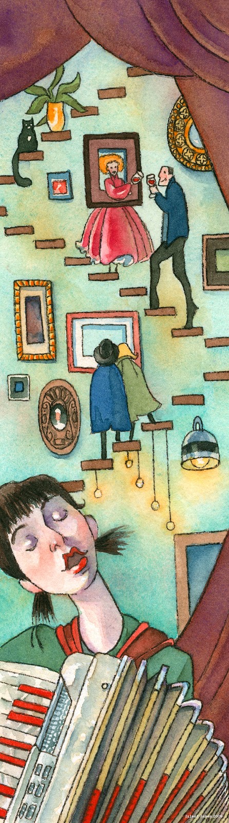
The nature of freelance illustration is you end up working with many different types of art directors (if you're lucky). Some give you a detailed "grocery list" of everything they'd like to see in the image, and others leave you to your own devices and trust your creative intuition. I much prefer the latter and I believe it makes for better images. In 2007, I illustrated an article for Where Calgary magazine about these First Thursday art events. The composition was interesting because it was so thin and tall, I let my imagination run wild! Where Calgary was one of my favorite clients, the whole experience was always first rate!

Where Calgary Nov/Dec 2007
The accordion the girl is playing is a Titano "Ladies" accordion, it was a lemon that I bought in Nassau county. I foolishly bought it without playing it first, it had many sticky keys and the bellows wheezed. It looked very pretty tho. This was also one of the first illustrations I made with my set of Schmincke watercolors, which I still use to this day.

Where Calgary Jan/Feb 2009
Late next year in 2008, I was contacted by them again to create four illustrations about upcoming theatre productions involving food. These are some of my favorite (if not my favorite) commissions I have ever done as a freelance illustrator. 1) Frankenstein 2) Berlin 3) Gilgamesh 4) Circus

Where Calgary Jan/Feb 2009
These ran in their Feb 2009 issue, article written by Sally MacKinnon. I wish I could have attended the productions, they sound incredible!

Tapping the Essence of Box Wine the Rambler Jan/Feb 2008
The Rambler was another favorite client of mine. I really loved their magazine, not just the fact that I was in it- but the content itself. Jan 2008, I illustrated this short story called "Tapping Into the Essence of Box Wine" written by Eva Danielle Wolfberg. I painted the journalist flowing out of the box wine spout interviewing a "Bacchus" type man. One of the things I remember about this piece was that I painted a tiny Caravaggio in a frame in the background that is completely indistinguishable.

Summer of Skin the Rambler May/June 2008
In the May/June 2008 issue of the Rambler, I was sent a very emotional short story written by Chad Simpson called "Summer of Skin". It was about the estranged relationship of a father and son, permanence, tattoos. The characters remark about a tattoo of a flower that is done so well it looks like it is growing out of the woman it is on. I drew the child coming out of that trying to connect with the father, and the father holding his arm which had the beginnings of a tattoo on it.

Before both of these, my first illustration job for the Rambler was for a short story called "Of Mice and Man", alas I lost the painting and the tear sheet. I wish I could find a copy of it. More than that, I wish I could remember the names of the art directors I worked with on these projects. It was about 10 years ago, with all the moves I've done I've lost some lists of clients, illustrations, tear sheets etc. That's another reason I'm archiving all of my work here. Enjoy!