Showing posts with label 2007. Show all posts

Monday, May 16, 2016

2007-2009 Political Illustration

From 2007-2009, I did a lot of illustrations for Manhattan Media. They owned a bunch of free weekly newspapers: NY Press, The Capitol, City Hall, West Side Spirit & Our Town. These were the lowest paying jobs with the quickest turnaround times, mostly political subjects, it was very depressing but I had to pay my bills. Part of me wanted to hide these forever, but the thing I like about this site is that you get to see a progression and another side of my work. So... here we go!

Some illustrators make a career out of drawing people they dislike, but it's not for me. I dislike the corruption, greed and blatant illegal practices of politicians. I must have drawn Bloomberg 20 times, it was torture.

Sptizer is another one I've draw too many times, he was a big deal during this time because he was caught being a patron of escort services. I think this country has its priorities mixed up. What we choose to be outraged by vs bigger issues we don't really care about.

Never have I had to draw a more horrific site! The art director told me where to place each politician on the tower based on how they were doing in the race at the time. I guess Obama laughed last.

Another cover I drew, I really liked this one because it did not feature a politician!

This was funny because the art director told me to draw him peering into the piggy bank. Esther exclaimed, "But he's BLIND!" She suggested I have him shake it next to his ear, I'm so glad I did that! How insensitive that would have seemed.

This one is one of my favorites for a very odd reason. I used frisket film to mask out the words on the chalk board, to really get the texture/feel of chalk. When I pulled it up, it did exactly what I wanted.
 
Don't get me wrong, I vote every chance I get. I'll never give up trying to make this country better, even against such corruption which is consistently rewarded.



Sunday, May 1, 2016

2007-2008 Creative Intuition

Where Calgary Nov/Dec 2007
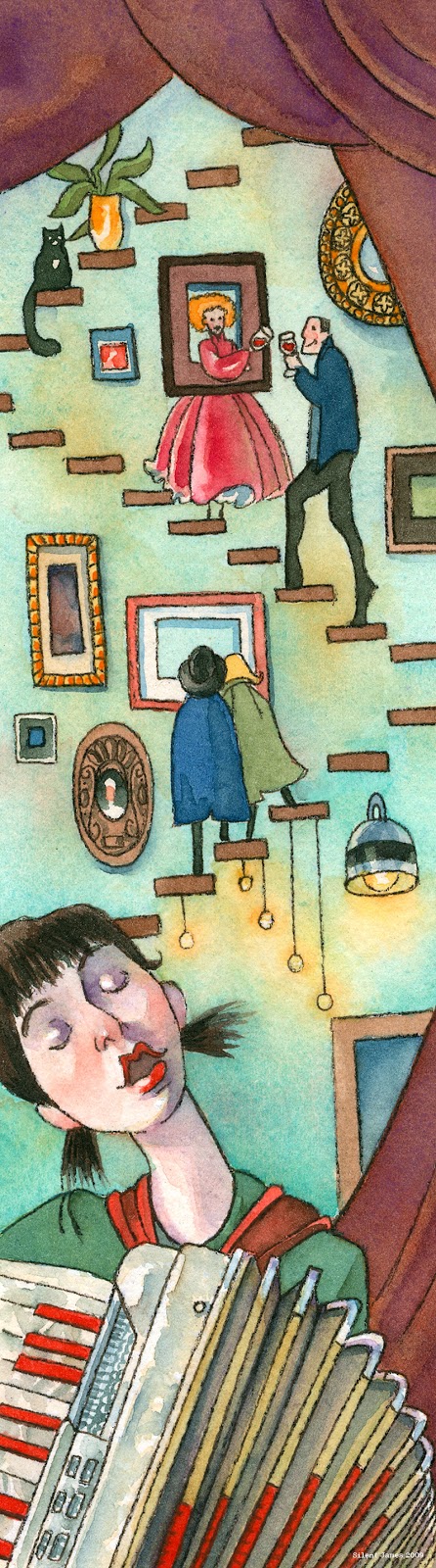
The nature of freelance illustration is you end up working with many different types of art directors (if you're lucky). Some give you a detailed "grocery list" of everything they'd like to see in the image, and others leave you to your own devices and trust your creative intuition. I much prefer the latter and I believe it makes for better images. In 2007, I illustrated an article for Where Calgary magazine about these First Thursday art events. The composition was interesting because it was so thin and tall, I let my imagination run wild! Where Calgary was one of my favorite clients, the whole experience was always first rate!

Where Calgary Nov/Dec 2007
The accordion the girl is playing is a Titano "Ladies" accordion, it was a lemon that I bought in Nassau county. I foolishly bought it without playing it first, it had many sticky keys and the bellows wheezed. It looked very pretty tho. This was also one of the first illustrations I made with my set of Schmincke watercolors, which I still use to this day.

Where Calgary Jan/Feb 2009
Late next year in 2008, I was contacted by them again to create four illustrations about upcoming theatre productions involving food. These are some of my favorite (if not my favorite) commissions I have ever done as a freelance illustrator. 1) Frankenstein 2) Berlin 3) Gilgamesh 4) Circus

Where Calgary Jan/Feb 2009
These ran in their Feb 2009 issue, article written by Sally MacKinnon. I wish I could have attended the productions, they sound incredible!

Tapping the Essence of Box Wine the Rambler Jan/Feb 2008
The Rambler was another favorite client of mine. I really loved their magazine, not just the fact that I was in it- but the content itself. Jan 2008, I illustrated this short story called "Tapping Into the Essence of Box Wine" written by Eva Danielle Wolfberg. I painted the journalist flowing out of the box wine spout interviewing a "Bacchus" type man. One of the things I remember about this piece was that I painted a tiny Caravaggio in a frame in the background that is completely indistinguishable.

Summer of Skin the Rambler May/June 2008
In the May/June 2008 issue of the Rambler, I was sent a very emotional short story written by Chad Simpson called "Summer of Skin". It was about the estranged relationship of a father and son, permanence, tattoos. The characters remark about a tattoo of a flower that is done so well it looks like it is growing out of the woman it is on. I drew the child coming out of that trying to connect with the father, and the father holding his arm which had the beginnings of a tattoo on it.

Before both of these, my first illustration job for the Rambler was for a short story called "Of Mice and Man", alas I lost the painting and the tear sheet. I wish I could find a copy of it. More than that, I wish I could remember the names of the art directors I worked with on these projects. It was about 10 years ago, with all the moves I've done I've lost some lists of clients, illustrations, tear sheets etc. That's another reason I'm archiving all of my work here. Enjoy!


Saturday, April 23, 2016

2007 Pan's Labyrinth

Pan's Labyrinth "Hermano" by Silent James 2007
I saw Pan's Labyrinth for free before it was released, we won some kind of giveaway. I didn't know anything about it, I found it very exciting and scary. Shortly after its release, the director held an art contest on the movie site, the prize was the 10 winner's work would appear on the dvd menu of the film. I quickly created 10 pieces and submitted them. The winners were chosen by popular vote from people that came to the site. I don't like that system, the director should have chosen, I've never been popular, haha.
I wanted this above piece to be half nice and half evil, summing up the whole film. I liked Ivana Baquero as Ofelia, she's a great actor!

Pan's Labyrinth "Bug" by Silent James 2007
This next one is usually a favorite with people. It's the most normal, nice looking piece in the bunch.

Pan's Labyrinth "Mama" by Silent James 2007
This one is gruesome, I like the watercolor effect on the belly. My friend Morgan saw the sketch, then saw the finish and exclaimed, "I didn't expect all that blood!"

Pan's Labyrinth "Trio" by Silent James 2007
I like the composition because all the shoulders flow into the arch. Esther loved Maribel VerdĂș in Y Tu Mama Tambien.

Pan's Labyrinth "Root" by Silent James 2007

I tried to draw most of these from memory, showing different perspectives etc. Morgan remarked about this one that it reminded her of the Rankin/Bass production of the Hobbit, which is one of my favorite movies of all time.

Pan's Labyrinth "Frog" by Silent James 2007
I like the hazy background in this one, I think I missed the mark with the characters in the foreground.

Pan's Labyrinth "Pale" by Silent James 2007
The Pale Man scene was my favorite in the movie, I loved the set up, the paintings on the wall, the creature, it all worked. I do not like his long fingers here or his red belly, but I like the doorway.

Pan's Labyrinth "Fathers" by Silent James 2007
I love the technique on the faun and the simple coloring of her face. I like this one.

Pan's Labyrinth "Final Task" by Silent James 2007
Pan's Labyrinth "End" by Silent James 2007
I have to be honest, I can't watch this movie anymore. I tried to watch it again years later and it was too violent, I don't think it's old age but who knows. I like Guillermo del Toro's sketchbooks. I can never keep my own because if I do one bad drawing, I toss the book aside because I can't bare to look at it every time I open it. I know it's insane, I'm working on that.
I look back on these images with delight. I do not work in this method anymore (I'm much happier not to) but I think these look pretty good.